Digital Accessibility Basics
Posted: October 18, 2023 | Author: Mark Whittaker | Read Time: 3 minutes
It can sometimes be a struggle to know where to start when considering issues that impact digital accessibility. The scope of the Web Content Accessible Guidelines (WCAG) can be overwhelming to newcomers, and the content may not be intuitive to less experienced content editors. This article will cover some common accessibility issues that can be fixed using simple techniques.
Headings
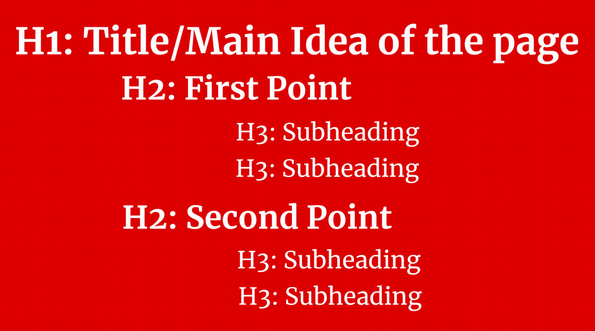
Headings are used to provide structure to a page. Headings are ordered from one through six, and create a hierarchy when used in content. Heading level 1 should only be used once per page as the page title. Start with heading level 2 if another heading is required, and headings should be used in order without skipping heading levels.

While headings do have unique visually features, they should not be used as a means to style content. Headings should not serve only as a subheading, and should be directly followed by content when possible.
Image Alternative Text
Alternative text, or "alt" text, provides a text description of an image. This is the text that will show up when an image isn't able to load, and is used to describe an image to assistive technology users. If an image has any text or is adds important context to a page, it must have alt text. It is usually safe to add alt text to an image if there is any doubt.
Color Contrast
Color contrast is the difference in light between two colors, typically the text and its background. A higher contrast rating means the content is easier to read. A standard web page using default site styles should never run into color contrast issues. Presentations, images, PDFs, and other documents often have more room for design and will need to consider how the colors work in relation to one another.
Color contrast is communicated using a ratio.WCAG AA requires contrast ratio of at least 4.5:1 for normal text, and at least 3:1 for large text. Large text is defined as 18 point (24px) or larger, or 14 point (18px) or larger if the text is bold. WebAIM's Contrast Checker is a useful tool to explore how colors can be used together.
Links
The goal for most pages is for users to find information they are looking for or to perform an action. One of the best ways to do this is through link text that is descriptive of the link's destination and/or the action that will occur when the link is used.
Do not use vague language like "Click Here" or "Read More" for links.
New Tabs or Windows
It is good practice to let users decide when they want to open new tabs, and to let them use existing browser features to go back and forth between existing pages. Opening links in new tabs should be avoided. When we open a link in a new tab or window, we must notify the user that this action will occur.
Audio and Video
Alt text on multimedia helps assistive technology users understand the context of the media without needing to interact with it. Multimedia should never autoplay, and any animations should be less than three seconds long. Audio must include captions or a transcript. Video should have audio descriptions whenever possible.
Tags: Digital Accessibility

