Visual Identity
For everything you need to visually represent SUU’s identity, from logos and fonts to colors and photography standards, this Visual Identity page is your resource. While the main brand page highlights SUU’s messaging and personality, here you’ll find style essentials to ensure cohesive, recognizable visuals across all communications. Dive into the guidelines that bring consistency to our brand’s visual elements.
This Page Includes:
Consider viewing the Brand Map to gain a deeper understanding of SUU's brand voice and design system.
Logos
Explore the various Southern Utah University logos and guidelines for their appropriate usage.
Institutional Logo
This is the official logo of our university, and should be used wherever possible. Use in either full color on white, or white on SUU-Red. Keeping to only those two color variations will help build repetition and visual equity. Clear Space: The height of the logo. Minimum clear space is half the height. Minimum Size: 1.25”
Primary
Primary Reversed
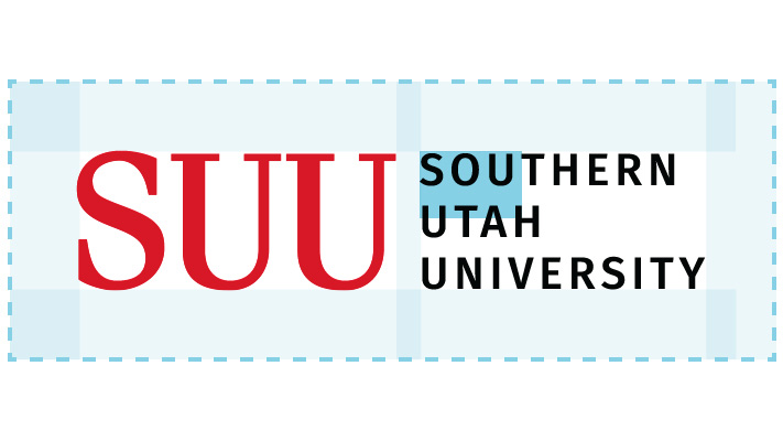
Primary Clear Space

Stacked

Stacked Reverse
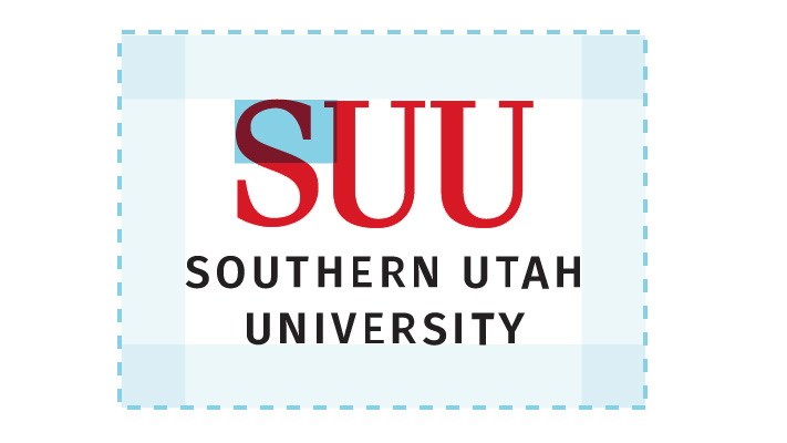
Stacked Clear Space
Acronym

Acronym Reverse

Acronym Clear Space
Combination Mark
This mark symbolizes SUU school spirit, and can be used in swag, T-shirts, or if the audience is students or alumni, as it is easier to personally connect with than the primary logo. Clear Space: The width of the middle ‘U’. Minimum clear space is half the width. Minimum Size: 0.75”
Primary Combo
Combo Reversed Black
Combo Reversed Red
Combo 1 Color
Combo 1 Color Reversed

Combo Clear Space
SUU Seal
The seal should only be used on degrees, awards, and materials related to the president & the cabinet. Overuse can incur dilution of its power & quality. Minimum Size: 1”

Primary Seal

Seal Reversed Black

Seal Clear Space
Athletic Logo
This mark represents SUU Athletics, and should be reserved for their use. See Athletics style guide for usage rules. Since it doesn’t include context of SUU, rare usage is encouraged.
Athletic
Athletic Reversed Red
Athletic Reversed Black
Secondary Logo System
All SUU Departments are allowed an on-brand letterhead and logo design to call out their entity within the organization. In order for us to speak with 1 voice, these designs must be highly uniform to ensure sub-entities still reflect the larger organism of SUU. Variations based on audiences and use case have been allowed to help make these logos as usable as possible. If you have not received a secondary logo, fill out a design request to have your logo assets designed and delivered to you.

Primary

Stacked
External
Social Profile Icon
Badge Red
Badge White
Campaign Wordmarks & Badges
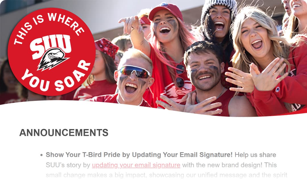
The primary campaign mark is the black and red wordmark. It is used to convey the boldness of the tagline. The wordmark needs to be paired with an SUU logo or other University identifier to ensure place is established.
The badge version of the campaign tagline is versatile. Not only does it display the tagline but the circular shape breaks up the hard lines of the photo frames. It also has a sticker feel to complement the collage feel.

Primary Tagline Wordmark

Secondary Tagline Wordmark
Campaign Badge
Color
This color system makes our primary brand red, the contrasting star of the overall scheme. Use red strategically in your designs as a key call to action in a neutral or natural palette.
Red has the challenge of differentiation with other Utah universities, so opt for red tints and neutrals over using the darker maroons when layering reds.
Brand Colors
SUU-RED, and the scale of SUU-WHITE to SUU-BLACK are our main brand colors. Almost all communication created for SUU will be overwhelmingly these colors. It can be used in multiple ways, color on lights, whites on color, or color on darks.
It is also acceptable to use a primary palette of neutrals, only black, white, and grays, using red as a call to action or accent color. When layering red colors for depth, go lighter before you go darker, to communicate vibrancy, youth, surprise and welcoming.

SUU-RED
#DB0000
0-100-95-10

SUU-BLACK
#000000
75-68-67-90

NEUTRAL GREY
#999999
43-35-35-1
Typography
Headings: Merriweather
Merriweather is a versatile serif font that can feel adventurous or serious. It is an eye-catching and distinct typeface that is ideal for headings. Available via Adobe and Google Fonts.
Body Copy: Barlow
Barlow is a solid, multi-weight, sans serif font that is well-suited for both body copy and secondary headings. Paired with Merriweather it offers an air of sophistication, while providing a stable foundation for SUU's handwritten fonts. Available via Adobe and Google Fonts.
Accent Font: Handwritten
We are human, welcoming, and approachable. SUU's "This Is Where You Soar" campaign communicates this distinction using Permanent Marker Pro and Felt Tip handwritten fonts. Permanent Marker is available via Adobe and Google Fonts and Felt Tip is available via Adobe Fonts.
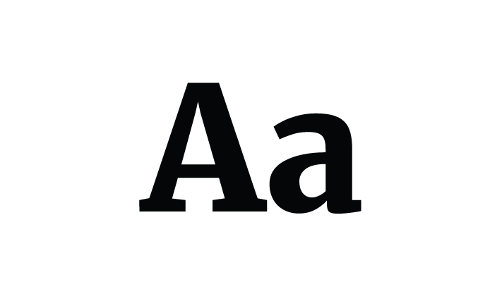
Merriweather
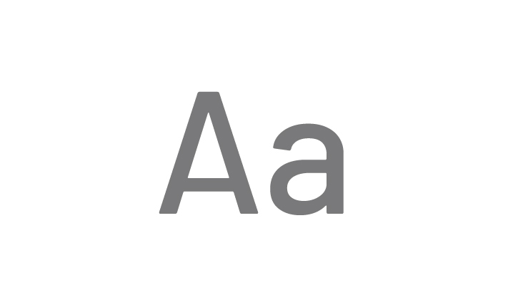
Barlow
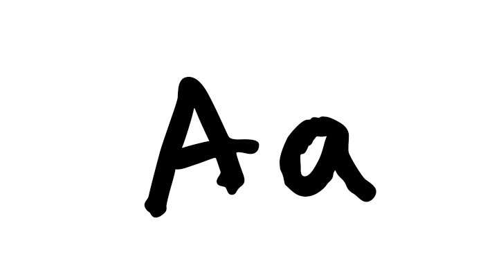
Handwritten
Photo & Video
Let's explore the visual language of SUU. From capturing raw moments to crafting nostalgic narratives, our photos and videos tell the story of our university.
Authentic Moments, Real Stories
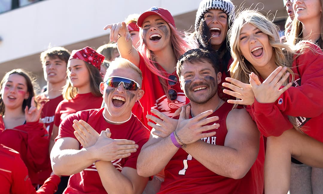
We are student focused and their stories drive the stories of the University. We share in those moments, help shape them, and capture them as they happen.
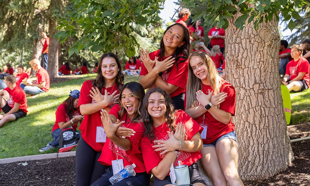
Moments of Purpose
To create a strong impact, the core of any photo or video should tell a story that resonates with the audience. Strong framing that clearly shows a memorable SUU moment is the best way to connect with viewers.

Connection to People
Capture the context of SUU’s support system; this may not be the primary focus of the photo/video, but the purpose is to illustrate the connections that help students reach success and make lasting memories. SUU students never soar alone.

Nostalgia for Place
Photo and video should enhance the lore and legacy of SUU, evoking memories of significant moments and the places where they occurred. Photo and video may draw upon personal experiences (student, faculty, staff, alumni) and meaningful objects that reinforce authenticity. Create a connection to the many experiences that define SUU's community and culture.

Graphic Styles
Our illustrations are as unique as our university. Learn about the styles that shape our brand.
Illustration Style
Hand-Drawn
We are the most human university in Utah, so make sure illustrations feels human. Use hand-drawn shapes that are difficult for computers to make.
Organic Shapes
We are out of the box, and our shapes are too. Use organic forms wherever you can, especially over sharp angles and geometric shapes.
Illustration Resources
Streamline Illustrations: An extensive package of illustrations (30,000), vector editable, and includes fill and line versions of each image. Best used for print applications.
Shapes and Forms
Circles should be used frequently, and should be used over squares and rectangles. They are more friendly, welcoming, and have more forward momentum than their blocky counterparts. Where other brands go geometric, we go organic, which is sometimes the harder choice, but inherently more human.
Pattern Library
Background textures are part of SUU's visual identity, primarily the topographical maps. They are subtle way of supporting a sense of place while functioning as a design element.

Icons and Symbols
Icons are a strategic element in SUU's visual identity, used sparingly and purposefully. Our website leverages the Font Awesome icon library, while Marketing Communications provides additional options for print materials.
Thunderbolts
As Thunderbirds, we use thunderbolts as a powerful and recognizable graphic element to energize our branding. With a curated selection of bolt styles, we add them as bullet points, accents, or containers to frame and highlight content. These versatile icons work best at smaller sizes, enhancing websites, brochures, and digital materials. Thunderbolts actively reinforce our identity and bring vibrancy to our visual storytelling.
Icon Styles
Icons are preferred in either Grey-7 #999999, SUU-Red #DB0000, or white #FFFFFF on red. Rarely, if ever, show an icon in thick black. They should be supporting visual elements so try to reserve the highest contrast for the text in your designs.
![]()
